
WE HAVE TUNNEL VISION
In the beginning was the word. And that word was: “visualisation”. It was supposedly uttered by Philipp, Bernhard and Florian when they set up eguana in 2015. Just how much has changed over the past 10 years – and what the future still has in store for us – is demonstrated today by our “visualisation expert” Philipp Eder.
Let's get visual


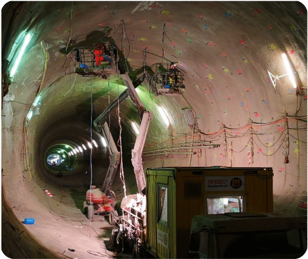
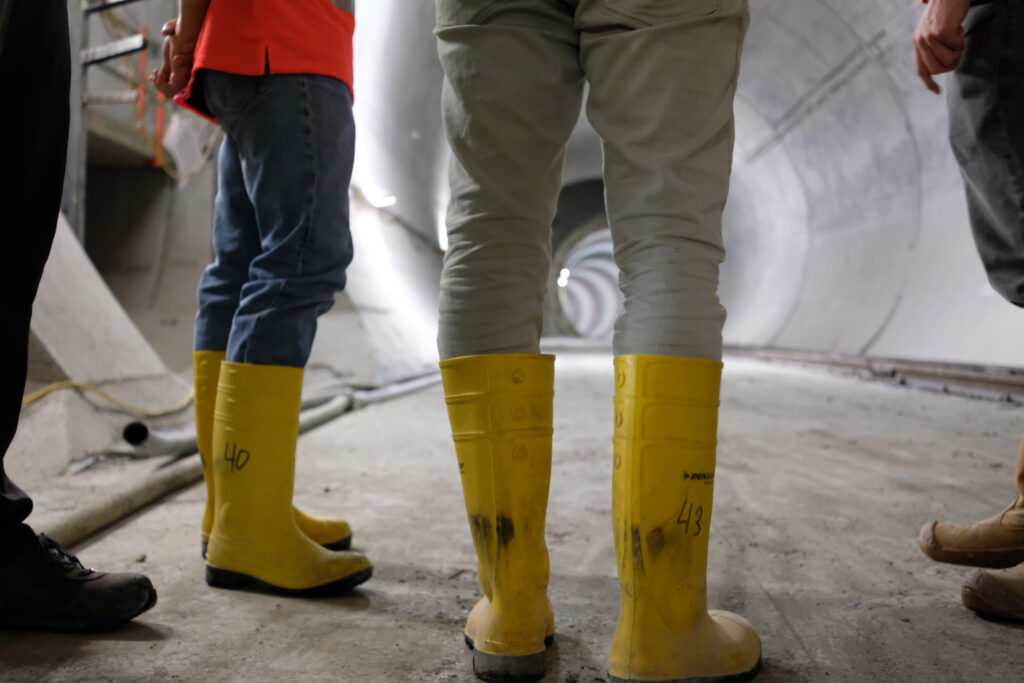
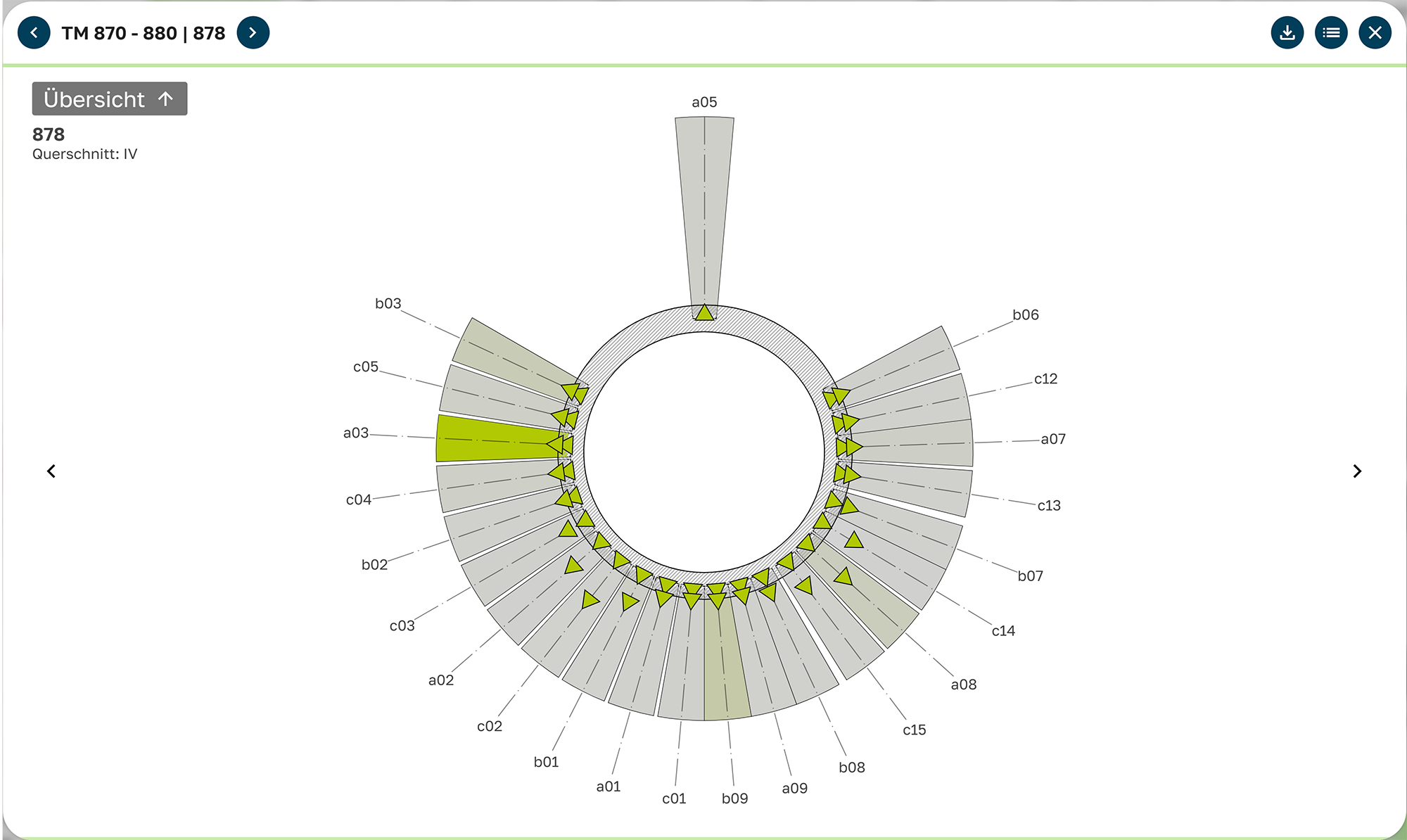
Stuttgart 21 / Feuerbach Tunnel
The Feuerbach Tunnel (construction started in 2014, planned completion end of 2026) will in future run for over 3,000 metres from Stuttgart Central Station to Feuerbach Station.
Feuerbach was the first. Starting with simple floor plan visualisations, we moved step by step through interactive visualisations with clickable elements, graphical planning and image exports, right up to our latest stroke of genius (if we may be so immodest). “We call it VIS 3.0,” says Philipp Eder. “We don’t want to reveal exactly what it is just yet; it’ll be a surprise. But this much can be said: the name gives away more than we’re actually allowed to.
Keep it Simple
What began in Feuerbach has developed rapidly.
But first we had to ask ourselves: what actually makes a good visualisation?
For us, it’s quite clear: intuitive operation. As always, we’ve stripped things down to the essentials. When only the absolutely necessary controls remain, so that users can’t click on anything by mistake, the user interface is perfect. The colour palette has been deliberately chosen so that the colour of the control element reflects its function. When it comes to the user experience, Philipp Eder comes into play; as an architecture student, he is skilled at breaking down complex content so that it can be understood at a glance.

Goal
Geometry
Appearance
Typical Example
Processing
Unfold the surface
True to the original shape
The shape changes
Metal tube slit open
Defined Projection
Representing perspectives
Angle-preserving
Length and area may be distorted
Map, mirror image
Conclusion
Developments are useful for production or materials planning because they show actual lengths. Projections help us understand shapes and spatial relationships.
Both have their place – depending on what you want to know.
Easy Peasy?
And other, seemingly simple topics have also occasionally presented us with unexpected problems.
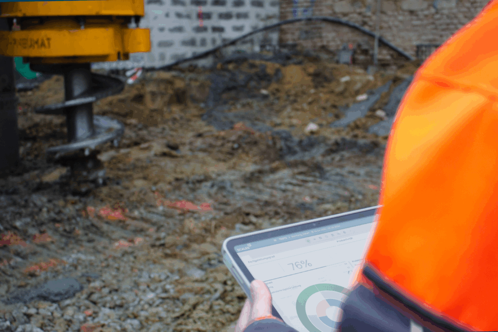
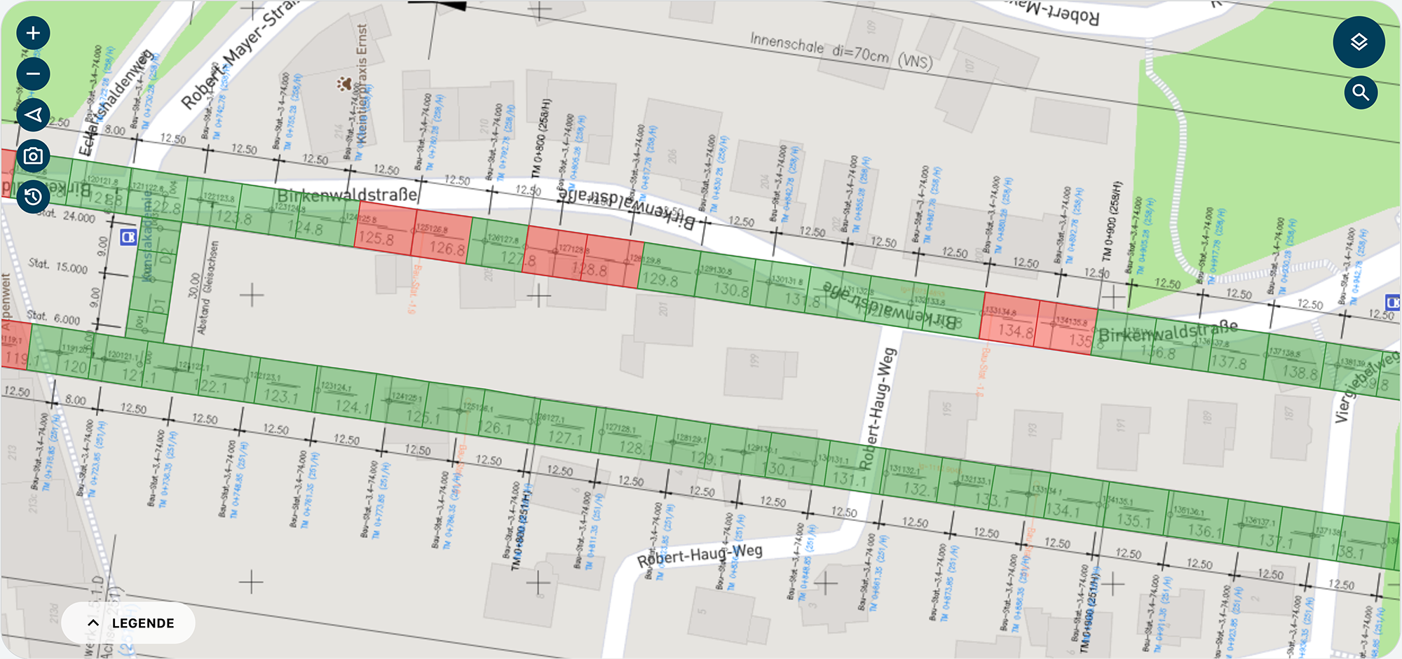
For example, to ensure users get the best possible overview of the construction site as soon as they open a visualisation, we like to place a satellite or street map in the background. We thought this wouldn’t be difficult to implement. After all, to ensure the points appear in the correct location on the map, precise GPS coordinates of the starting points are required. Unfortunately, we soon realised that these are not always easy to obtain. In the simplest case, we receive plans surveyed using Gauss-Krüger coordinates, which allows for direct conversion (provided one knows where the construction site is located and to which zone or meridian strip the coordinates are assigned). Often, however, we receive local, construction-project-specific coordinate systems. In these cases, conversion is either impossible or extremely difficult. That is why we have painstakingly adapted the visualisation to meet this challenge, so that we can also display points specified in local coordinates directly.
We learn from our mistakes
If ten years of eguana have taught us one thing…
‘Keep it Simple!’ is a great starting point, but if you add ‘expect the complex’, you get a better overall picture and realistic expectations.
And when things do work out without complications, the joy of the finished product is all the sweeter (if not, at least we’ve learnt something). Although ‘finished’ isn’t really the right word. As with Feuerbach, many other projects see new features added, new tweaks emerge that can be adjusted, and customers come up with ideas for features that make their lives easier.
Generally speaking, what matters to us is what the clients want or what the project requires. “Ultimately, it’s up to the clients to decide how ‘important’ something is,” says Philipp Eder. “My role is simply to assess how informative and enlightening a visualisation is for the construction project. A rough rule of thumb for me is: if I, as a semi-layperson, understand the measure and its success, then it’s a good visualisation.”
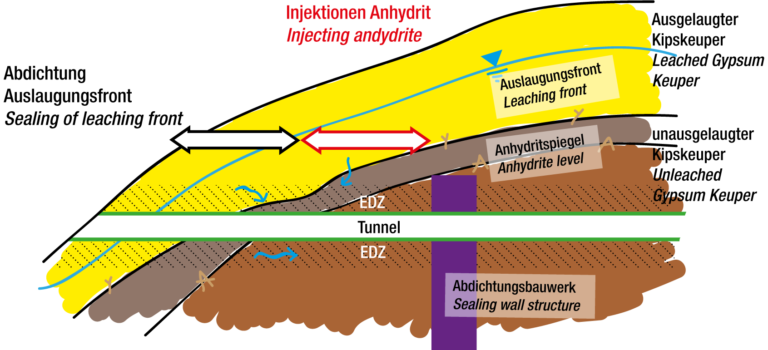
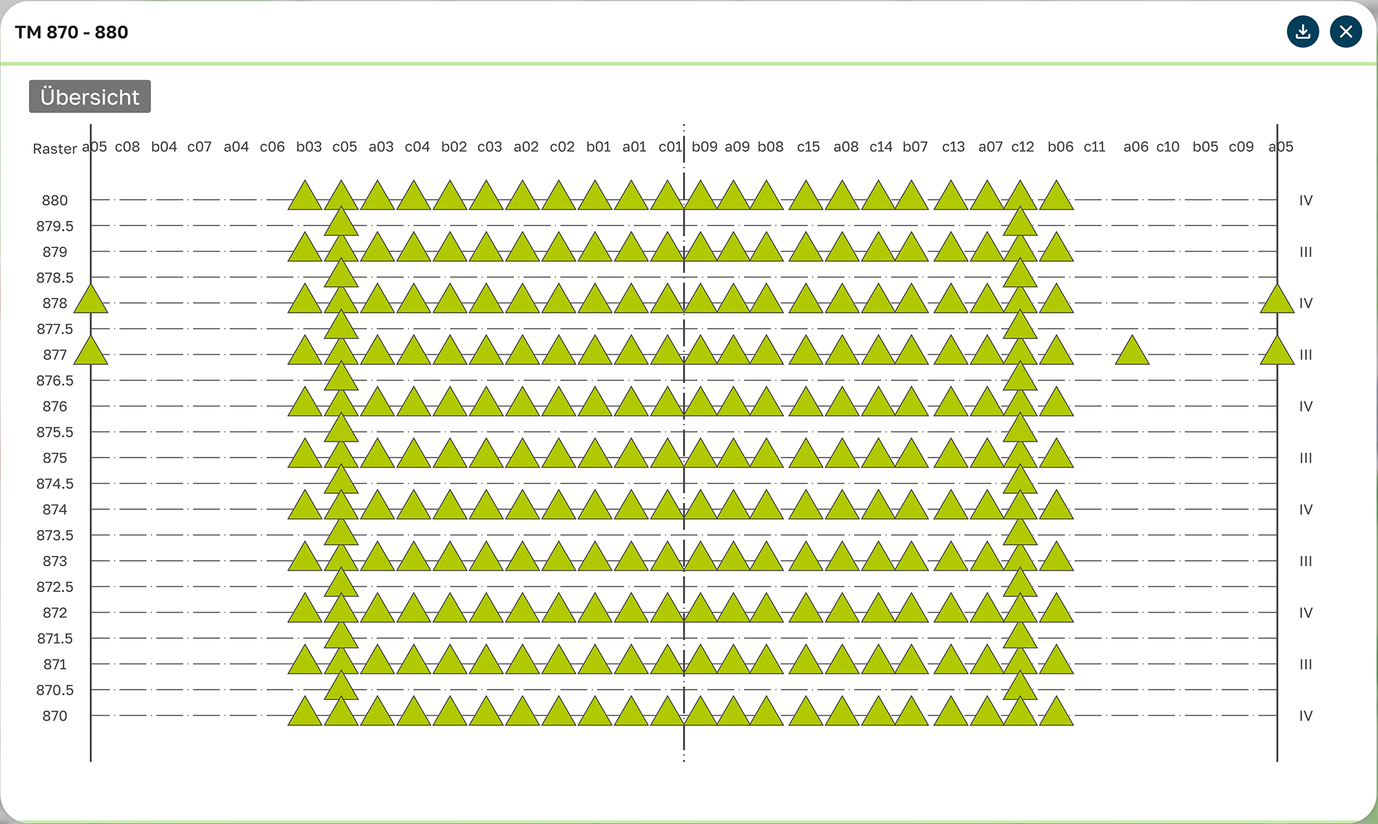
For him, the underground representation of the compensation injections stands out in particular: on a single screen, injection and settlement data can be combined across multiple layers that can be freely shown or hidden. This allows you to see live how the work is progressing and what the objective of each borehole is – “huge added value for the analysis”. But the contour line visualisation of the dewatering system also has a lot to offer. On the site plan of the construction project, it perfectly shows what is happening underground, where the planned groundwater level is after pumping, and whether the dewatering targets have been achieved.
A pretty, colourful picture – or a decision-making aid?
What actually distinguishes a pretty, colourful picture from an important decision-making aid?
Ideally, says Philipp Eder, there is no difference:
“A pretty, colourful picture is a decision-making aid – provided it is set up correctly. For example, the threshold values must be appropriate for the construction project, and the values displayed must truly reflect the construction process.”
Philipp Eder
“A visualisation must therefore be accurate and purposeful. Only then can I see at a glance what needs to be done next – ‘An injection is still needed here’ or ‘The settlement funnel is correct, we can carry on.’ To do this, I need clear scales, comprehensible figures, layers that can be shown or hidden, and ideally a function to view changes over time. It’s easy to make something look nice – but it only matters if it suits the construction project.”
Philipp Eder
Style
Heatmap
Points
Contour Lines
Areas
Strokes
Text
What is being displayed
Lines & Vectors
Numbers, Labels
Typical Application
Grundwasserspiegel, Setzungen
Construction phases, zoning
Grid axes, element axes
Thresholds, IDs, measured values
Visualiuation-Types in SCALES
Display Type
Type
Floor Plan
Unfolded View
Schematic Approximation
Projection
Explanation
Top View in 2D (Standard)
Unfolded tunnels, embankments or cavern areas
Highly simplified geometry (e.g. tunnel axis as a straight line)
3D data projected onto a defined plane (views and sections)
Intended Use
Feature
Status Display
Drawing-Elements
Labels
Statistics
Drawingmarkers
Interaction elements
Purpose
Important additional features
Feature
Viewing Period
Screenshot Tool
Search
Benefit
Rewind/fast-forward measured values via the timeline
One click, PNG is downloaded
Type in borehole ID or layer name, tooltip appears on the element
Display colour scales and isolate layers by threshold value
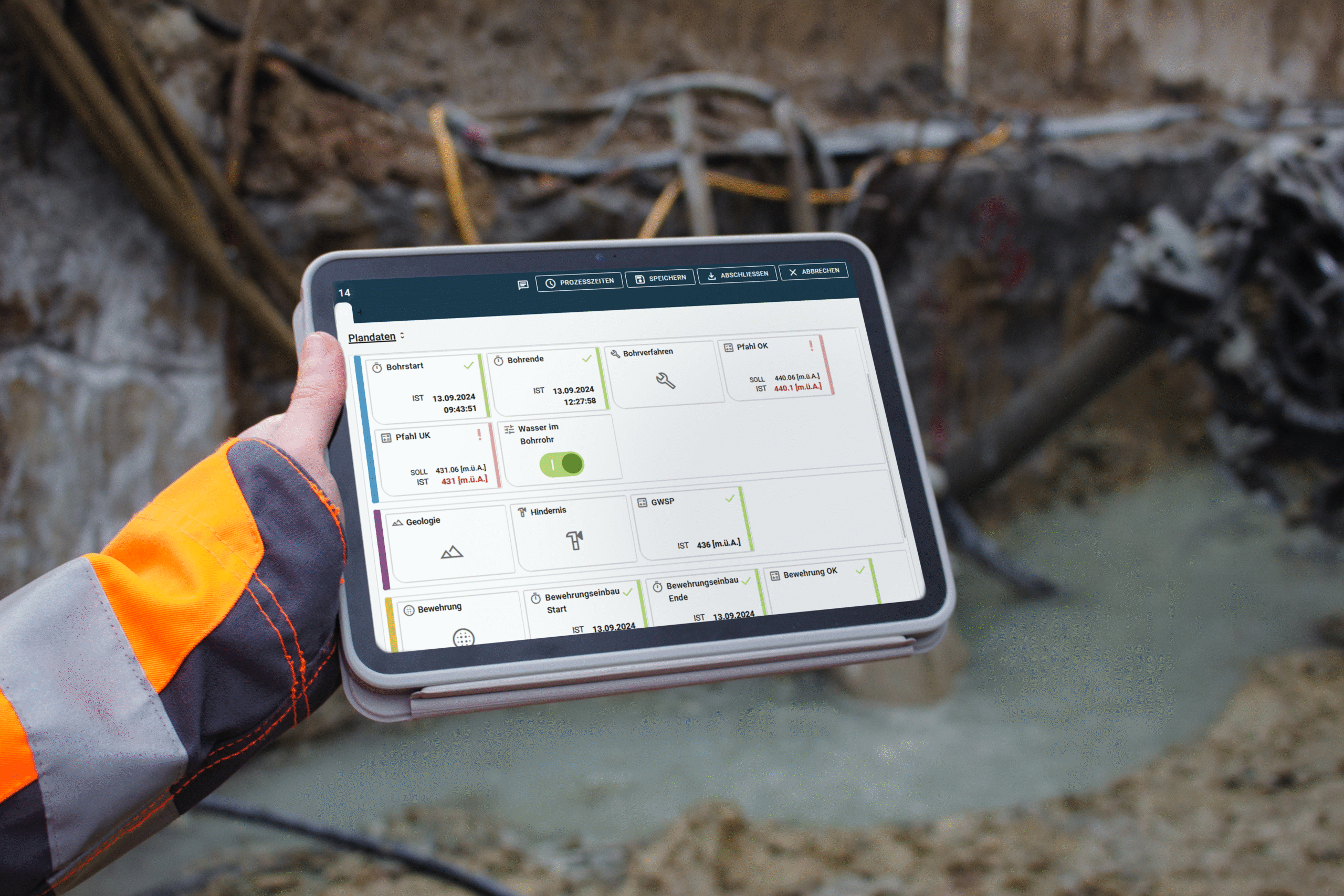
“In five years’ time, I see SCALES as a seamless 3D environment – no more separate modules, but a stage where everything comes together,” says Philipp Eder. “You upload your plan data, and immediately the entire building appears before you as an interactive 3D model. All analyses take place in the same space: click on a component, a window opens and an AI spits out the relevant key figures, possible interpretations or warnings in real time – no jumping back and forth between tabs, no context switching. And then the icing on the cake: the same model is superimposed directly onto the construction site as an augmented reality overlay. You point your tablet or smart glasses at the tunnel lining to check whether the grouting volumes behind it are correct, where grouting is still missing, or how the settlement cone is actually forming beneath you. In short: planning, monitoring and decision-making merge – spatially, temporally and cognitively. In this way, visualisation isn’t just a pretty, colourful display, but maps the digital construction site precisely over the real one.”
Philipp Eder

Conclusion: More than just pretty to look at
Visualisations have long been more than just pretty pictures: they help us make decisions, avoid mistakes and keep track of things. Even with complex structures, countless measurement points and changing conditions. In practice, they show what really matters: where there are deviations. Where adjustments need to be made. Or where everything is running smoothly.
“Without the visualisation, we’d have no idea where all the material was used”
A user’s comment on a SCALES visualisation (unfortunately, all projects are always so top-secret that we’re not allowed to name names 😉)