Because sometimes less really is more
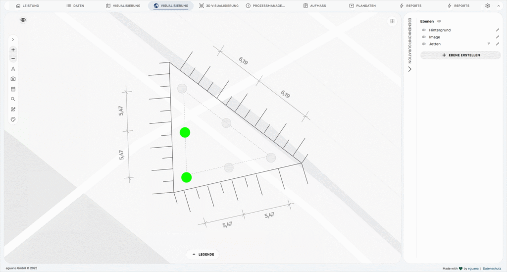
Autumn is here, time for a cosy city break. At the hotel, you’re handed a wonderful city map straight away (leave your smartphone in the room – you’re doing a digital detox or something 😉). Full of enthusiasm, you set off to explore your new surroundings and take a first look at your brilliant city map. And a second one. It goes without saying that there are roads. But what use are the trees marked on the map? Street lamps? Power cables, fibre-optic, gas and water pipes?
I can see clearly now
When we started developing our first visualisations, the goal was clear: to make construction sites more vivid, data more tangible, and decisions easier. What began as a simple point overlay on a digital map has since become a powerful tool. A tool that not only shows what was – but helps to understand what is happening, why it is happening, and what this might mean for the rest of the construction process.
It’s working fine – so why a new visualisation?
I see something you don’t see.
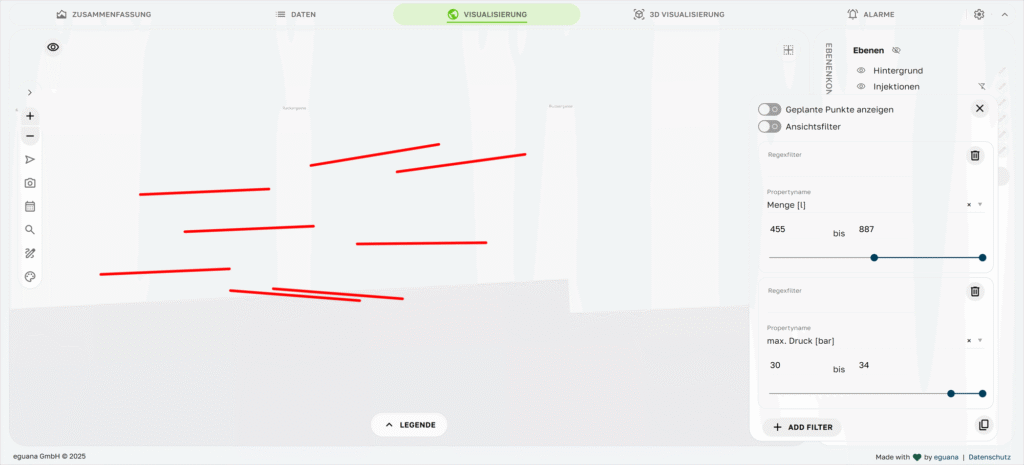
Seek and you shall filter
Have you ever tried filtering your injection data to show only those injections where a pressure of at least 5 bar was reached during the initial pressurisation? Or getting an overview of all boreholes that took longer than 20 minutes to reach the first three metres? A visualisation of all those measurement points where the elevation has changed by more than 3 cm in the last 48 hours?
Frustrating – especially because you’re not searching specifically for these data sets out of boredom. Most of the time, you have a good reason and, what’s more, you’re under considerable time pressure.
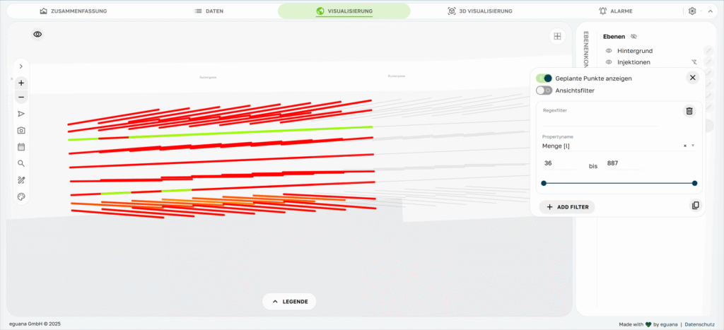
This not only makes it considerably easier to spot anomalies. It also makes it much easier to spot patterns, whether spatially or over time. For example, is a particular area of the excavation pit conspicuous? Are there differences depending on location or depth? What does the development look like over the course of the project?
All of this can now be visualised individually with just a few clicks.
It’s just a jump to the left …
We’ve got X-ray vision
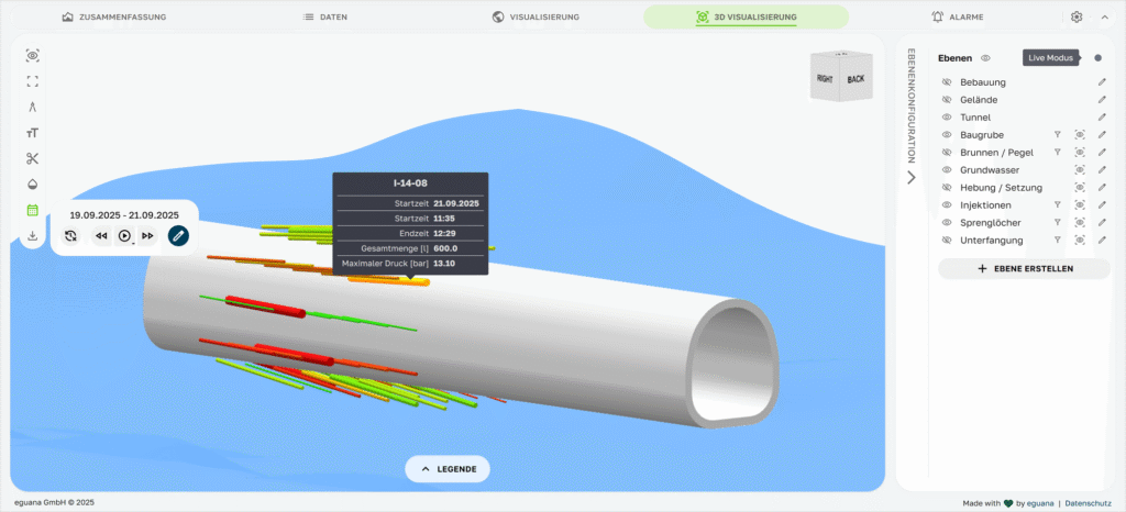
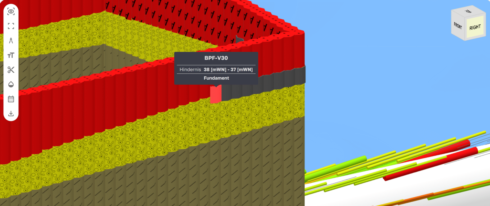
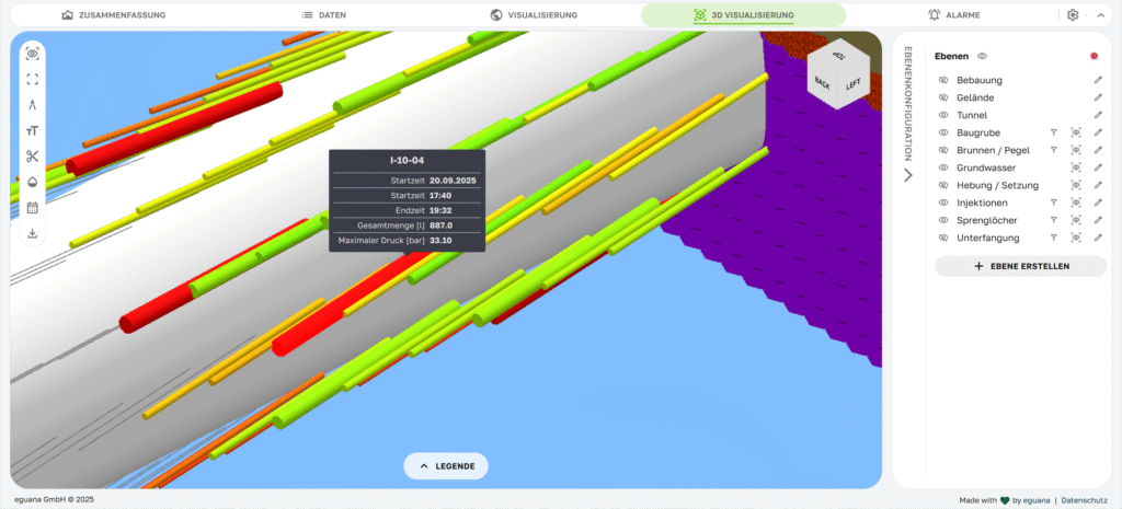
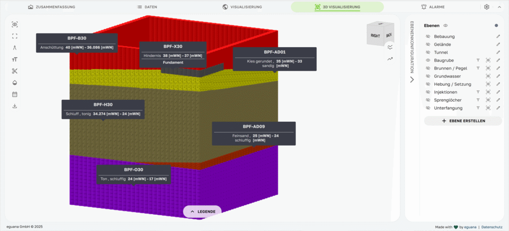
The real heart of the new visualisation is the 3D model
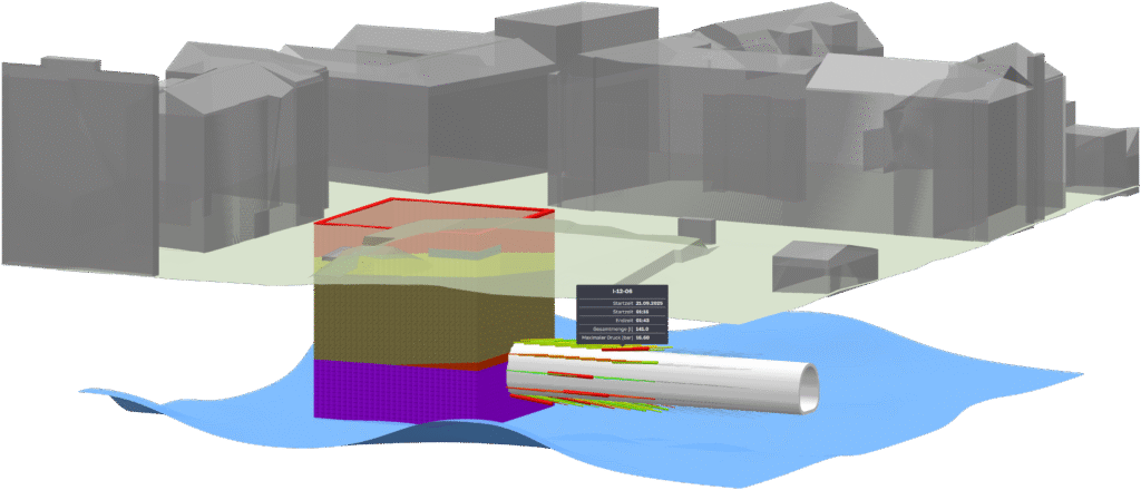
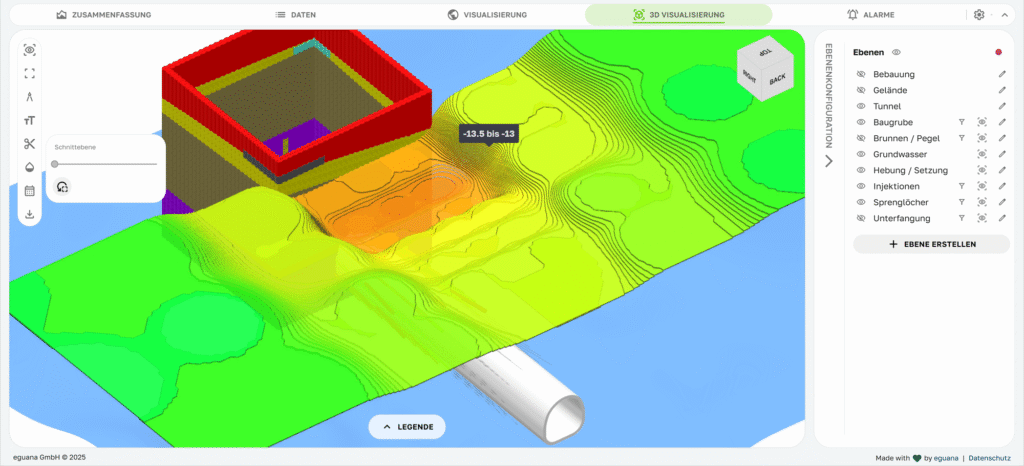
We’re all the more delighted that, with the new visualisation, users can see their structure exactly as it actually lies underground. Including all relevant elements – from the excavation pit, through injection points, bored piles and diaphragm walls, right through to water levels and settlement measurements.
The visualisation is, of course, just as interactive as our 2D visualisations: you can zoom, rotate, pan and layer the view. Individual objects can be selected, their properties displayed, or colour-coded according to parameters such as volume, duration, pressure or time. If you wish, you can add time as an extra dimension. And just like that, we’re suddenly operating in four dimensions!
As usual, the new visualisation also works with the entire SCALES database (machine data, measurement data, manually recorded data, etc.). This means there are no errors caused by data discontinuities. And because we see data quality as the key to success, every object is uniquely referenced, every point precisely located, and every measurement comprehensively documented.
And so this isn’t just a new visualisation. We truly make visible what is happening beneath the surface, thereby making the entire project more tangible for everyone involved.
But I liked it the way it was before!
No one likes being presented with a new user interface in the middle of an ongoing project. We know exactly how it feels when a button suddenly isn’t where you’re used to finding it.
So, for all ongoing projects, the visualisation remains exactly as you’re used to.
VIS 3.0 is now the standard for all new projects. For ongoing construction sites already using older visualisations, this view will remain in place – unless there is a request for a changeover. In that case, we can offer an optional upgrade – including the changeover, data migration and customisation. If you’re interested, just send us a quick message and we’ll get back to you with the next steps.
A picture is worth a thousand Excel sheets!